 Once you deflect the accusation that a
cabal of Jewish commie anthropologists is stifling discourse on human variation
and that there really are just, like, four kinds of people – there really is an
interesting question lurking behind all the nonsense. Namely, if there
really are, say, four kinds of people out
there, then how come nobody noticed it until 1684? That’s the year that François Bernier, French
physician and traveler, anonymously published the idea, in an early scientific
journal, that there is a correspondence between a para-continental region and a
particular kind of person. Until then, European
scholars had been content to see human variation as patterned locally.
Once you deflect the accusation that a
cabal of Jewish commie anthropologists is stifling discourse on human variation
and that there really are just, like, four kinds of people – there really is an
interesting question lurking behind all the nonsense. Namely, if there
really are, say, four kinds of people out
there, then how come nobody noticed it until 1684? That’s the year that François Bernier, French
physician and traveler, anonymously published the idea, in an early scientific
journal, that there is a correspondence between a para-continental region and a
particular kind of person. Until then, European
scholars had been content to see human variation as patterned locally.
Bernier’s
idea passed largely unnoticed, but within a few decades that is precisely what
the naturalist Carl Linnaeus and the philosopher Immanuel Kant were teaching
about the human species. What made the
previously hidden pattern within the human species suddenly so obvious?
We generally point to three things that
combined to construct this scientific fact (in spite of its empirical falsehood). First, long voyages by sea, rather than over
land. By land, like Marco Polo, one
tends to be struck by human continuity and local variation. But by sea, one can be struck far more
readily by the discontinuity between the people you left behind three weeks ago
and the people you are encountering now, in the rest of the world in the 17th
century. This would promote seeing human
variation as discontinuous.
Second,
the encounter with unfamiliar and fluid social and political forms, often
strikingly different from the carefully regulated borders and centralized
governments familiar to Europeans. This
would promote seeing large groups of people as essentially homogeneous.
And third, the
development of science as a source of authoritative knowledge. Science, to some extent, begins with
collecting, organizing, and systematizing the diverse things one encounters in
the universe. The natural history that
swept across the European academy in the 18th century was predicated
on precisely that kind of work, spearheaded by the Swede, Carl Linnaeus. For Linnaeus, the most fundamental question
was always “How many kinds of something are there”? There were several kinds of mammals, of which
one was Primates; four kinds of Primates (Homo,
Simia, Lemur, and Vespertilio [the bat]), two kinds of Homo (sapiens and troglodytes), and four kinds of Homo sapiens (americanus, europaeus, asiaticus, and afer).
Clearly, Linnaeus was wrong
about a lot of things. But he did develop
modern biology, which is why his face is on Swedish money, and yours isn’t.

Yet of course the idea,
whether to Bernier, Linnaeus, or Kant, didn’t come out of nowhere. It turns out there was a sort of idea that
the people of a single continent could be embodied in a single image, except
that it was intended entirely allegorically, and not to be taken
literally. And that was 17th
century cartography.
Before the discovery of America,
world maps sometimes depicted the three known great landmasses. But they didn’t tell you that there was a
kind of person associated with each one.
The closest you could get was the idea that three sons of Noah – Ham,
Shem, and Japheth – went forth and founded the peoples of Africa, Asia, and
Europe, respectively. But that didn’t go
very far as a narrative of human differences, since they were all old Middle
Eastern men, and brothers, to boot. (Around the world are the winds, and to the left are monstrous peoples.)

By the late 16th
century, after the discovery of America, mapmakers begin to embellish their
maps with images of people. In this 1577
map by Gerardus Mercator, the figures in the corners are actually allegories of the
elements of which the universe is composed: Earth, Air, Water, and Fire.

In fact, they are not just personifications of the elements, but embodied by the Roman gods, with Jupiter and Neptune on the left. (I'm guessing Juno and Ceres on the right.) But only a few years later, this 1592 map
by Petrus Plancius is filling the corners with different information.

Yes, those are images of women, symbolizing the continents, with some of the trappings of the continent, and some of its native beasts, one of which is a kind of chair for the Continent-person. America (which he calls Mexicana) sits on an armadillo, Africa is on a crocodile, Asia rides a rhino. Only Europe is not seated on an animal, but eats from the Horn of Plenty. (There are some bulls in the background, the bull associated with Zeus's visit to the continent's namesake.)
Likewise, in this 1602 map
by Hondius. Now the corners are filled with images of women representing the continents themselves.
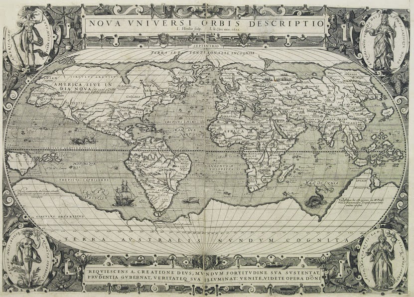
And here are the women.


Likewise, in this 1638 map
by his son, Hondius.

And close-ups of the people embodying the continents. There's Europe, with her horse, stag, and horn of plenty.

And Asia, with a camel, some incense, and the wealth of the orient.

And there's Africa, uncovered and with an elephant.

And finally, America, feathered, and about to shoot an alligator with a bow and arrow.

That was kind of cool. Here's a 1652 map by Claes Janszoon Visscher. He's got pictures of the Roman emperors at the top and bottom. In the corners are the female personifications of the continents.


Interestingly, and quite uniquely, he doesn't stop there, for in addition to the female allegories, he also shows you what people look like. Here are the Europeans (from Amsterdam), Asians (from Jerusalem) , and Africans (from Tunis) on the left side of the map. And on the right are images of north, central, and south Americans. The point is that he is communicating two things simultaneously: allegorizing the continents as female figures, and showing you what the actual people on the continents ostensibly look like.
Here is a 1670 map by Philipp Cluver, or Cluverius (who died in 1622; they reprinted these maps quite extensively.). Once again, you can see images in the corners embodying the continents and to some extent racializing them.

Here are the corner images, personifying the continents. That would be Asia with her camel, Europe with her bull, America with something in a tree, and Africa with a lion.


Yet all of these maps are earlier than François Bernier’s 1684 scientific paper, on a new division of the earth, beginning the unification of its continents and its human types. The difference is that the scientists actually took it literally, while the mapmakers initially intended it as art – a simple allegory.
By the time of Linnaeus’s first go at it, in System of Nature (1735), the image was already a familiar one. Four continents, four kinds of people.

That would be whitish Europeans, reddish Americans, dark Asians, and blackish Africans. He hasn't quite sorted out the color scheme, or the species - but he is pretty confident that there are four kinds of people, each associated with a continent. He'll have that done by the tenth edition of 1758. And this will become science, because of Linnaeus's vast influence over systematic biology.
But the image was there for the better part of a century in European cartography. Each continent had its own person. They just didn't intend for it to be taken so literally. I think this is an example of science imitating art, by taking what was initially intended as an allegorical image, and having it become so familiar - and so reasonable, given the political historical relations I mentioned up top - that it could be literalized and incorporated into the science of the 18th century.
That is, of course, the scientific conception of the human species that Nicholas Wade promotes as modern, in his new book.
A wonderful lesson with such a rich collection of old maps! I love old maps!
ReplyDeleteIt makes one wonder how race would be perceived if early cartographers had used circular paper, rather than rectangular with four corners.
ReplyDeleteThis comment has been removed by the author.
ReplyDelete